This is the second post in a series chronicling Ma’ayan Dembo’s internship with the San Francisco Bike Coalition, for the Internship Capstone of the Urban Studies major at Stanford University.
Yesterday at the San Francisco Bike Coalition I created power point presentation on Wayfinding Signage. After a quick Wikipedia search, I affirmed my suspicions that wayfinding referred to the signage and materials throughout the city used for Although it is extremely important for both tourists and residents alike, wayfinding is given little weight as an integral part of urban design.
SAN FRANCISCO, CURRENTLY
Currently, San Francisco uses small green signs with a bicycle in white, along with the given route number and directional arrow to suffice for wayfinding. While these signs are clearly marked and straightforward, they are small and hard to spot if you are not actively searching for them. They do not feature the mileage or time until the destination though, which is common on many other wayfinding signages. In addition, San Francisco now also has green sharrows indicating bike routes and lanes, obvious signs that are clear to both cyclists and drivers.

THE EMBARCADEO
Along the Embarcadero, there have been a few interesting wayfinding projects that connect the space, its history, and public art together. Throughout a two-mile stretch, there are various bronze sea creatures carefully placed along pedestrian seating, tying the area back to its seafaring connections. In addition, there are 22 black and white posts featuring poetry (in a variety of languages), historical anecdotes, and photographs. These posts are easy to spot and create an informative walking experience. Moreover, at many major intersections, there is a plaque in the sidewalk explaining the origin and significance of the street. For example, at Vallejo Street the plaque explains the contributions of General Vallejo. 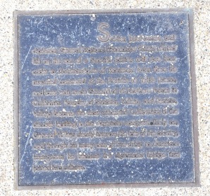
WALK RALEIGH
While doing my research I found a few interesting wayfinding campaigns throughout the country and internationally. A particularly striking example is in Raleigh, North Carolina. A group of concerned citizens wanted to promote walking in the city as an effective means of transportation. This group created placards featuring time, length, and direction to popular destinations around town and hung them up in the middle of the night. Upon completing the project, the City of Raleigh took a liking to the project and is adopting it as a permanent feature of the city landscape. 
After scouring through pages of wayfinding examples, I synthesized the best and created a list of characteristics for successful signs. Since pedestrians and bikers require different information for best addressing their needs, I have differentiated them.
PEDESTRIAN WAYFINDING SIGNS
Pedestrian wayfinding signs should be in close proximity to the walkway—preferably along it. They should feature a small map of the surrounding area, along with a point indicating the current location. Thematically, they should be well integrated into the surroundings and enhance the overall walking experience by providing interesting information or simply visual stimulation. They should also direct people toward popular destinations—both for tourists and residents.
BICYCLING WAYFINDING SIGNS
Bicycling signage differs from pedestrians since cyclists cannot stop to search for a sign, it should therefore be obvious to spot from the road and clearly convey information in the least crowded way possible. The sign should include route number, arrowed directions to popular destinations, and the distance in miles and/or time. This information is important for cycling commuters, tourists enjoying the San Francisco hills, or residents traveling by bike. The signs should be uniform throughout the metropolitan area, not just the city. Overall, bicycling signage needs to be informative, clear, and in an obvious location.


Recent Comments